Find User
here you can look for a user
Version 0.6.0 Change
With the latest version now live on chrome i wondered what every ones opinion i on the new layout?
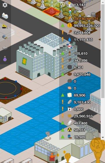
Personally i like getting rid of how many decimal places it runs off, specially with some resources going past tens of millions it just makes it much more easier on the eye!
New storage method is now quite challenging.. Each building can hold a set ammount of the resource, so yes you can see what each building has stored in it but not a grand total left for that resource. Im currently searching how much space i have left for resources while getting the insufficient store message but to no avail. Does every one think you need to know your storage limit? personally i dont think you can manage your world without knowing it
The colour changes when in loss or full was also quite helpful!
If my undestanding is correct the new number next to the resource is the gain or loss per minute?
[Peshawar] Plastic Power house. " Biggest Exporter of plastic since China". Charter: CYTzUnpQ
Just FYI, I am not finished with the 0.60.0 update yet. The total storage available amount will still be in the game. It is going to show up on the little hover window when you mouse-over one of th resources on the top. It will also be in the resources tab of the statistics screen. I have a few other changes coming to the resources readout too.
Owner of Ape Apps, LLC
! am not sure I compleatly understand your post .
So ill just ask How do I see the storage limits now ? And yes we need to know storage limits how the heck else will we know when space is full ?
OMG THE ROLLING resource Banner is GENIUS .
As for the number part you nixed on resources well Personal not a fan but realize it is need .
heck even in many clicker games that give the opption ill choose long number version just to see them moving .
WE need a way to see total Storage not by buildings BUT it does NOT need to be in the Banner ( man I love that))) A simple pop out showing total storage would work just find . After all once I know I remember so don't need to see it all the time , Ill raelly miss teh long number version so will many people Hint .
MAN Bast taht banner is such a great Idea cant say genius enough .
PS get choose maybe you could add a option to turn off short number and use old type wile KEEPING the rolling bANNER (((( GENIUS GENIUS GENIUS ))))) brilint even get to see all teh resources moving wile reducing space usage to ONE LINE .
MAN That rolling banner is genius now why teh heck didnt i think of that !!! GENIUSSSSSS
FRICKING GENIUSSSSSS
GOD I love that rolling banner congrads you found a way to add resources wile only having ONE LINE
I underestimate you way to much darn that is good
I underestimate you way to much darn that is good
@colbya based on your suggestion, before I finalize 0.60.0, I will add two new engine settings:
1 - turn on/off shorter resource numbers
2- turn on/off max storage capacity on resource banner
that way people can have it however they like.
glad you like the scrolling banner, i believe this may finally be a reasonable fix for the clustered resource layout
1 - turn on/off shorter resource numbers
2- turn on/off max storage capacity on resource banner
that way people can have it however they like.
glad you like the scrolling banner, i believe this may finally be a reasonable fix for the clustered resource layout
Owner of Ape Apps, LLC
now that i think of it, i think a keyboard binding would be good to toggle the settings also. that way you could quickly flash on/off the storage capacities.
Owner of Ape Apps, LLC
well add that if you want but a pop out for storage would be what I use .
and what most people will the key binds are ok .
I think a small popout tab ( Like when on android the way the build tab hides would be best . PS I will fight to keep the rolling banner omg Totally genius .
I would rather lose the long numbers then the Banner . Just crossing my fingers you mite combine the banner with the longer Verison numbers on - off
and just a simple tab when you click to see total storage
PS Least we forget antiq man so good the best idea yet
or you could even add it to stats in the left hind game settings area .
I see you also left the drop down ( i always use the side build bar so resources counter stays on top .)
That rolling banner is so good only time i will ever use the drop down again is when i first gain a resource .
I see you also left the drop down ( i always use the side build bar so resources counter stays on top .)
That rolling banner is so good only time i will ever use the drop down again is when i first gain a resource .
On mobile, the traditional dropdown style is retained because obviously the resources at the top would take up half the screen or more:
but now on mobile, when you tap on the resources, it now switches to a modified 2 line layout, similar to the new desktop version, along with scrolling banner:
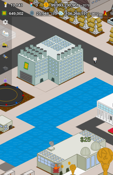
The one-line method doesn't work on mobile, but I think two-lines is still pretty good, and leaves a lot of room to see.
The scrolling banner is here to stay on both mobile and desktop, and the user will be able to show either long numbers or short, whatever they prefer. I think the new scrolling banner looks great, and I haven't really noticed any performance impact from it.
but now on mobile, when you tap on the resources, it now switches to a modified 2 line layout, similar to the new desktop version, along with scrolling banner:
The one-line method doesn't work on mobile, but I think two-lines is still pretty good, and leaves a lot of room to see.
The scrolling banner is here to stay on both mobile and desktop, and the user will be able to show either long numbers or short, whatever they prefer. I think the new scrolling banner looks great, and I haven't really noticed any performance impact from it.
Owner of Ape Apps, LLC
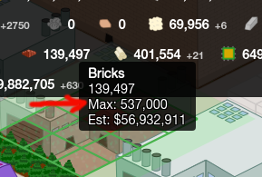
Also on desktop now, the max capacity for a resource will show up when you mouse-hover over a resource:
Owner of Ape Apps, LLC